You are here

August 2017

August 31, 2017
August 31, 2017

Featured Design Partner: SK Designworks
 

Located in West Philadelphia, the EAT Café provides a welcoming space to nourish the community through good food and fellowship. The custom designed website perfectly reflects the welcoming nature of the restaurant while effectively organizing the various activities, events, and educational programming the EAT Café provides.

The Design and Development

4x3 worked closely with SK Designworks to develop this beautiful website for both EAT Café and their affiliate, The Center for Hunger-Free Communities (CHFC). 

"Designing the EAT Café site was fun working with illustrations and hand-drawn touches to real-life photo images. 4x3 understood our vision and carried it through seamlessly."
Soonduk Krebs | Art Director | SK Designworks

As the technology partner, 4x3 collaborated with SK Designworks to flawlessly incorporate all aspects of the site, including the ever-changing menus, graphics, and news about the café and the initiative behind it.

Learn more about the EAT Café website »

About SK Designworks

SK Designworks is a full-service graphic design firm located in Center City, Philadelphia. The studio, led by Soonduk Krebs, views each project as a unique creative opportunity and does not try to impose a set style or “look” upon their work.

Visit SK Designworks website »

4x3 News

August 28, 2017

The EAT (Everyone At the Table) Café is a non-profit, pay-what-you-can restaurant that nourishes, educates, and unites the community. 

Located in West Philadelphia, the EAT Café provides a welcoming space to nourish the community through good food and fellowship. The custom designed website perfectly reflects the welcoming nature of the restaurant while effectively organizing the various activities, events, and educational programming the EAT Café provides.

The Design and Development

4x3 worked closely with SK Designworks to develop this beautiful website for both EAT Café and their affiliate, The Center for Hunger-Free Communities (CHFC). 

"Designing the EAT Café site was fun working with illustrations and hand-drawn touches to real-life photo images. 4x3 understood our vision and carried it through seamlessly."
Soonduk Krebs | Art Director | SK Designworks

As the technology partner, 4x3 collaborated with SK Designworks to flawlessly incorporate all aspects of the site, including the ever-changing menus, graphics, and news about the café and the initiative behind it.

ABOUT SK DESIGNWORKS

SK Designworks is a full-service graphic design firm located in Center City, Philadelphia.

The studio, led by Soonduk Krebs, views each project as a unique creative opportunity and does not try to impose a set style or “look” upon their work. SK Designworks' portfolio features a wide range of projects performed for a diverse group of clients, including Rowan University, The John Templeton Foundation, W.S. Cumby, Inc. and SEPTA. 

Visit SK Designworks website »

Support EAT Café 

The restaurant's ongoing operating costs must be met through café operations, grants and funding, and in-kind support. 4x3 supports EAT Café by offering free web hosting.

Learn more about how you can support the EAT Café at eatcafe.org.

August 25, 2017
August 25, 2017

GF&M Law Website Highlights SEO-Friendly Site Structure
 

When GF&M Law contacted 4x3 for a redesign of their website, we worked closely with the firm to create a site that reflected the class and professionalism of GF&M but also was functional on all devices and SEO-friendly.

Thoughtful Structural Design for Businesses

4x3 specializes in business web design; we strive to create just the right website for each client. Our services range from custom CMS design and development to logo design and visual branding and beyond. 

Our work with GF&M Law focused not only on a functional responsive design, but also site architecture and accessibility. The GF&M law firm website homepage and interior pages are optimized for search engines, potential clients, and fellow peers. 4x3's thoughtful design integrated SEO-friendly structure into every aspect of the website. 

Learn more about why site structure matters »

GF& Law website homepage

ABOUT GF&M LAW

Gordon, Fournaris & Mammarella, P.A. is a law firm located in Wilmington, Delaware. Their staff boasts a number of highly skilled attorneys and paralegals prepared to fight for their clients in cases about Captive Insurance, Trusts and Estate Planning, Fiduciary Litigation, Commercial Real Estate, and more.

The firm is also affiliated with The First State Registered Agent Company. GF&M Law can provide incorporation services for Delaware corporations and formation services for Limited Liability Companies and Limited Partnerships.

Visit their website to learn more »

4x3 News

August 21, 2017

When GF&M Law contacted 4x3 for a redesign of their website, we worked closely with the firm to create a site that reflected the class and professionalism of GF&M but also was functional on all devices and SEO-friendly.

Thoughtful Structural Design for Businesses

4x3 specializes in business web design; we strive to create just the right website for each client. Our services range from custom CMS design and development to logo design and visual branding and beyond. 

Our work with GF&M Law focused not only on a functional responsive design, but also site architecture and accessibility. The GF&M law firm website homepage and interior pages are optimized for search engines, potential clients, and fellow peers. 4x3's thoughtful design integrated SEO-friendly structure into every aspect of the website. 

Why Structure Matters

Good site structure is at the very core of organic SEO.

GF&M Law's SEO-friendly site structure is one of the most crucial aspects of a site’s SEO performance. We purposely created a site with logical and hierarchical site structure. This allows users to finding pages where they’re expected, thus locating what they are seeking more quickly. The more appealing GF&M Law's site to users, the more appealing it is to search engines, too. Google’s algorithm uses information from users to rank the site. 

Good site structure enables great user experience, which in turn provides the site with higher Google ranking and sitelinks on search engines.

Visit GF&M Law's portfolio »

ABOUT GF&M LAW

Gordon, Fournaris & Mammarella, P.A. is a law firm located in Wilmington, Delaware. Their staff boasts a number of highly skilled attorneys and paralegals prepared to fight for their clients in cases about Captive Insurance, Trusts and Estate Planning, Fiduciary Litigation, Commercial Real Estate, and more.

The firm is also affiliated with The First State Registered Agent Company. GF&M Law can provide incorporation services for Delaware corporations and formation services for Limited Liability Companies and Limited Partnerships.

Visit their website to learn more »

August 15, 2017
August 16, 2017

Custom Navigation for Historic Odessa Foundation
 

After being approched for a website redesign, 4x3 implemented an efficient, user-friendly solution for the Historic Odessa Foundation that prioritized content management and custom navigation. The resulting website design allowed visitors to clearly discover and understand Historic Odessa's wealth of information.

Organizing a Content Rich Website

To effectively organize all the important historical information about Historic Odessa's buildings and grounds, as well as their nonprofit mission, 4x3 created a responsive website design that divided the information into readable, easy to navigate sections. On the top of the page, we created a dual navigation bar for visitors to quickly find the information they need.

Read more about the importance of custom navigation »  

ABOUT HISTORIC ODESSA

The mission of the Historic Odessa Foundation is to preserve and promote the homes, grounds, collections and historic legacy of Odessa, Delaware. The Historic Odessa Foundation is charged with raising money, maintaining Odessa’s historic assets, supporting scholarly and archeological work and educating the public in the history of the town and the state of Delaware in the 18th and 19th centuries.

Learn more about our work with the Historic Odessa Foundation »


4x3 Ideas

August 14, 2017

When approached by the Historic Odessa Foundation for a website redesign in 2010, 4x3 was tasked with implementing an efficient, user-friendly solution that prioritized content rich management and custom navigation. The resulting website design allowed visitors to clearly discover and understand Historic Odessa's wealth of information.

Organizing a Content Rich Website

To effectively organize all the important historical information about Historic Odessa's buildings and grounds, as well as their nonprofit mission, 4x3 created a responsive website design that divided the information into readable, easy to navigate sections. On the top of the page, there are two custom navigation bars for visitors to quickly find the information they need.

Historic Odessa's Dual Navigation Bars

The top dark green navigation bar showcases general links that invite visitors to learn more about Historic Odessa Foundation, such as the "About Us" and "Sponsors" pages. Alongside these links, there are more direct call to action links, which provide functionality and ease of accessibility to the first-time visitor, such as directions and contact information. 

4x3 decided to further clarify the user experience for Historic Odessa visitors by complementing the top dark green navigation bar with a second navigation bar below the logo. This navigation bar features links that showcase current updates as well as other callouts to encourage visitors to plan their visit. In unobtrusive but visible all-caps text, the navigation bar suggests that you learn about Historic Odessa's history, become a member, and keep up to date with foundation news.

The Importance of Custom Navigation Bars

For both returning and first time visitors, these dual navigation bars highlight current happenings at Historic Odessa that they might be interested in attending. This not only encourages visitors to want to return to the website and visit Historic Odessa's grounds again, but also enables better organic search results through fresh content updates. The integration of content updates with a seamless, simple but beautiful website design is the best way for visitors to find what they're looking for and facilitate ongoing engagement with the Historic Odessa Foundation.

Updating and Managing Content on Historic Odessa Foundation

In addition to organizing Historic Odessa's information through good web design, 4x3 also updates and manages content for the foundation regularly. 4x3 creates and pushes out social media posts across all platforms, promotes Facebook event posts, and sends out a reminder newsletters for Historic Odessa's various exhibitions and memberships.

By creating a user-friendly, accessible destination in the form of Historic Odessa's website, 4x3 was able to ensure that any social content updates link to a source that guides the visitor to more information and motivates them to visit Historic Odessa, Delaware.

ABOUT HISTORIC ODESSA

The mission of the Historic Odessa Foundation is to preserve and promote the homes, grounds, collections and historic legacy of Odessa, Delaware. The Historic Odessa Foundation is charged with raising money, maintaining Odessa’s historic assets, supporting scholarly and archeological work and educating the public in the history of the town and the state of Delaware in the 18th and 19th centuries.

Check out the Historic Odessa Foundation's portfolio »

August 9, 2017
August 9, 2017

Prevention Works! Design

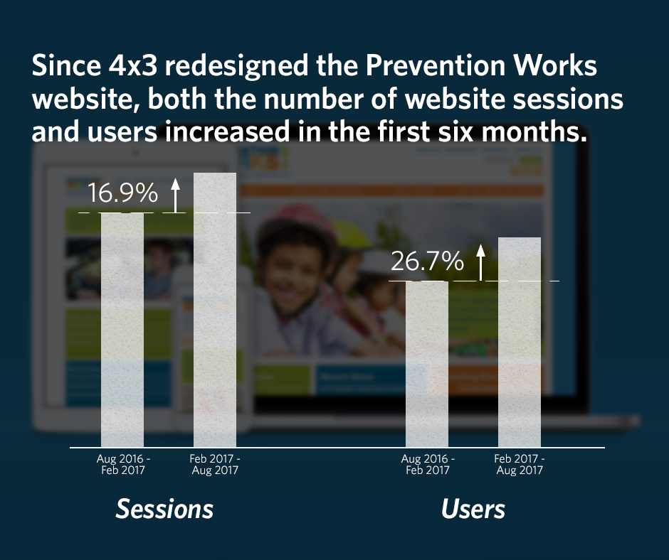
Back in February, 4x3 redesigned Prevention Works! website. The new site strategically-focused on responsive design across desktop, mobile and tablet with custom Google maps as functional modifications to increase organic SEO and visitors. Looking back, we compared analytics from 6 months before the website redesign to the 6 months after the upgrade. 

Since the redesign there has been a significant increase in both website sessions and users. More people - through unique user visits - are coming to the Prevention Works! website, as well as staying on the site longer throughout each session. The percentage of sessions increased by 16.9%, while the percentage of users increased by 26.7% over the past 6 months.

Read the case study »  

ABOUT PREVENTION WORKS

PreventionWorks-NJ.org is the official website of Northern NJ SAFE KIDS/Safe Communities. The Northern NJ SAFE KIDS coalition work is to prevent childhood injury through research, community outreach, legislative advocacy and media awareness campaigns. Safe Kids Worldwide has over 500 chapters and coalitions in all 50 states, and has partners in 25 countries.

Learn more about our work with Prevention Works! »

4x3 News

August 7, 2017

Back in February, 4x3 redesigned Prevention Works! website. The new site strategically-focused on responsive design and custom Google maps as functional modifications to increase organic SEO and visitors.

Responsive Design

The new responsive design allowed Prevention Works! to fit the screen sizes of any mobile device. This new responsive design increases the website's credibility, click-through rate and lead generation. With society's on-the-go lifestyle, a responsive design is a necessary feature for any modern website. 

Custom Google Maps

Prevention Works! hosts several location-based services across Northern New Jersey. The new Drupal-based web platform allows Prevention Works! to use a sophisticated multi-layer, interactive map that enhances the website's usability, social integration and local SEO.

The Results

We compared analytics from 6 months before the website redesign to the 6 months after the upgrade. Since 4x3 implemented responsive design and custom Google maps on the Prevention Works! website, there has been a significant increase in both website sessions and users.

More people - through unique user visits - are coming to the Prevention Works! website, as well as staying on the site longer throughout each session. The percentage of sessions increased by 16.9%, while the percentage of users increased by 26.7% over the past 6 months.

ABOUT OUR CLIENT

PreventionWorks-NJ.org is the official website of Northern NJ SAFE KIDS/Safe Communities. The Northern NJ SAFE KIDS coalition work is to prevent childhood injury through research, community outreach, legislative advocacy and media awareness campaigns. Safe Kids Worldwide has over 500 chapters and coalitions in all 50 states, and has partners in 25 countries.

As a non-profit sponsored by Morristown Memorial Hospital, their mission is to reduce fatalities, injuries and property damage due to unintentional injuries on the road, at home and at play. As such, Prevention Works! provides complementary safety services through Northern New Jersey.

August 2, 2017
August 2, 2017

Design Partner Cause Design

The professional relationship between 4x3 and Cause Design studios has allowed for us to create a user-friendly, beautiful, and functional site that showcased The John Templeton Foundation's annual report in a streamlined, beautiful way. 

As the technology partner, 4x3 works directly with Cause Design from the beginning of each project, to determine the scope, define the site architecture, and consult on functionality. Cause Design provides creative solutions, and 4x3 takes the lead on the programming and development. For The John Templeton Foundation's annual report in 2015, 4x3 created a user-friendly web experience that organized information in a legible, structured way.

ABOUT CAUSE DESIGN

Cause Design Company was founded by creative director Rodd Whitney, and lives by the principles that commitment to collaboration and exceptionally creative design is key.

Cause Design is a full-service creative company, delivering senior-level market research, brand strategy and positioning, marketing communication strategy, copywriting, photography and video production services through a network of like-minded individuals who share our strategic mindset and creative standards.

Visit the Cause Design website »