About a year ago, I programmed my first ever responsive website. I had heard of and seen them in action, but I never actually made one myself. It definitely was, and still is, a learning experience. My first few sites had some clunky and less than elegant responsive solutions in them. But in the past year, I’ve learned lots of tricks that make responsive sites easy to build and wanted to share.
Client Side Adaptive Image
So for this first post, here’s a helpful module that I use all the time. It’s called Client Side Adaptive Image and makes formatting images for different breakpoints super easy.
I tried several other modules for generating dynamic images in views or content type displays. Some didn’t work exactly as I had hoped or the setup was anything but easy to understand. But Client Side Adaptive Image (CSAI) just worked and the setup was very straightforward.
Adaptive Image
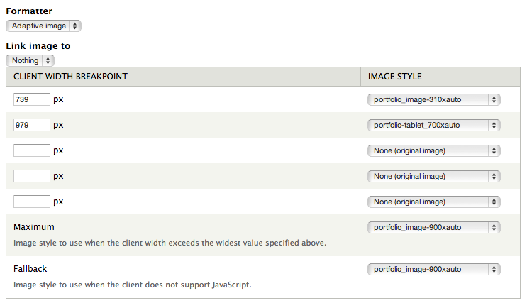
After you install and enable the module, you’ll be given the option to use ‘adaptive image’ when adding images to views, to panels or changing settings in a content type display. When selected, you enter breakpoint values, the image style you want to use for each and what style to use as the maximum.
When your browser is open all the way, your site will use the maximum size style. Make it a little smaller and once it hits a defined breakpoint, it loads a new image with the specified styled. It continues to use that image until you hit another defined breakpoint, and then the process is repeated.
Always make sure to set your maximum and fallback setting to the largest style the image will use. By default, both settings use the original size of the image which is usually way bigger than you need it. The fallback style is the one I always forget, it sets the style to use when a browser doesn’t support JavaScript. You’ll never notice that something’s wrong unless you look at everything in an older browser (especially early versions of IE).
Breakpoints
Here are the breakpoints I use when designing with the Omega theme...
- 1219px - If you’re using the wide layout that comes with Omega, this breakpoint sets the image for the standard/normal 960px wide layout. If 960px is as wide as your site will get, you can skip this one.
- 979px - Sets the size for images on tablets and smaller screens
- 739px - The last breakpoint that sets the sizes for phones, phablets and other smaller displays
I like to keep it simple and use as few breakpoints as possible, but you have the option to add as many as you want or need!

